
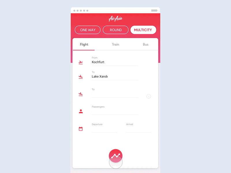
UI Challenge – Flight Search

In this post, I will go through another UI Challenge. I have picked Johny Vino‘s Flight Search design from 100 Mobile App Interactions which is mostly about animations and I will try to implement it as close as I can.
Let’s get to it!
First, we need to decompose this view into a few smaller parts:
- AppBar and top buttons
- Initial input
- Airplane resize and travel
- Dots travel
- Flight stop card view
- Flight stop card animations
- Flight ticket view
- Flight ticket animations
0. Starting point
As a starting point, we need to create a basic Flutter app and ditch all the unnecessary stuff so we end up with only a MaterialApp and a Scaffold:
. . .
1. AppBar and buttons
Stack widget, which allows us to easily put widgets on top of each other. Now let’s create an AirAsiaBar widget.We have created a simple stack containing a Container, which will be our background as well as transparent `AppBar` which is placed on top of the container. The height of the container has been extracted because further on the bar’s height changes a little and we would like to be able to reuse the same component. You can also notice a custom FontFamily. I have downloaded it from here and added it to pubspec.yaml. I know it is not exactly the same but I’d say it’s close enough 🙂
HomePage:
Expanded. I did only because I didn’t want to do it multiple times when I use the button. If I would actually want to create a reusable widget, I would advise against making it Expanded. Now let’s add those buttons to the HomePage:_buildButtonsRow inside of a Column which was inside of a Positioned. The Positioned widget is needed because we need to manually put all the content under the AirAsia label but on top of the AppBar background. A Column will be needed later so we can put a card with content under the buttons. At this moment our app looks like this:
. . .
2. Initial input
Stack in which we will place a small Container under the actual TabBar. You can see it in _buildTabBar() method.The harder part comes with the Input view. It is worth remembering that whenever you are using any
TextFields in Flutter you almost always want to wrap them inside some sort of scrollable views like CustomScrollView or ListView, so that when the keyboard appears your layout won’t get disrupted. However, in our example, we also want to place a FloatingActionButton at the bottom of the view. Technically we could place it under the ScrollView but that would cause it to be always there even if there are more fields to be scrolled to. We could also place it just inside the ScrollView, but then it wouldn’t be aligned to the bottom if there was a space for it.
The solution to that problem is using the following combination of widgets: LayoutBuilder which will provide us access to BoxContstraints, then we use SingleChildScrollView with ConstrainedBox and we pass maximum height we want our layout to have (obtained from constraints). In the end, we need IntrinsicHeight so that our view will fill as much space as it can but it will be able to render it in `ScrollView`. Now we can have a Fab that is aligned to the bottom but will also be scrollable if more content occurs.
Now let’s update home_page‘s line:
Container(), //TODO: Implement a card
with this:
Expanded(child: ContentCard()),


. . .
3. Plane resize and travel
TabBar names remain the same. Then there is a short delay after which plane starts to go forward with a simultaneous change of names in tabs (I will ignore that small animation of the names).
Let’s start with resizing animation. First, we will create a new Widget called PriceTab (to be honest I am not sure why it is a price 😀 ). We will place everything inside a Stack and we will mostly operate on Positioned widget to put widgets where we want them. In general, it is not trivial to get Widget’s size before it gets rendered but luckily we have wrapped our tab inside of LayoutBuilder so we have access to view constraints and therefore to Widget’s height. This way we will be able to calculate the widget’s padding top as followed:
PriceTab widget to the ContentCard :AnimationController and Animation objects related to the size of the plane.onInit() method an _planeSizeAnimationController which is a parent of actual size animation _planeSizeAnimation. This animation will scale from 60 to 36 which is the actual size we would like to achieve. We pass it to the AnimatedPlaneIcon widget which will be rebuilt on every animation change.- We have created a new Animation Controller.
- We have added an Animation to that controller, to get access to nice curve instead of a linear one.
- We have changed
_planeTopPaddinggetter so that it is dependent on_planeTravelAnimation. - We have added an
AnimatedBuilderwhich will rebuild the plane icon according to Animation’s value.
The last thing for that part is to add a trail and change the names in the tabs. When it comes to the trail, we just need to add it to _buildPlane() method. For now, let’s keep the length of it as 240.0.
EDIT: There was missing
- _minPlanePaddingTopin the_maxPlaneTopPadding. Add it to move the plane a bit from the bottom edge.
. . .
4. Dots travel
We can start by creating a dot class
PriceTab widget_dotsAnimationController which will control all dots animations. The interesting part is how every dot is animating. Technically we could create 4 animation controllers each to every dot but there is a better solution to that. We can use an Interval curve.Interval is an animation curve, that allows us to specify at which moment of whole animation (defined by AnimationController) we want a single animation to start. For example, if we specified in the controller the duration to 10 seconds and we created animation with an interval with start equal to 0.3 and end equal to 0.7 then our animation will start with 3-second delay and end after 4 seconds. This way we can have multiple animations overlapping with each other controller by one controller. We defined our animation to take 0.4 of time declared in a controller and each animation starts 0.2 after the previous one. We also defined what is the original and final position to every dot based on its index and card height. We have added all animations to the list so that we can pass them to AnimatedDot widget which will handle drawing a dot.
. . .
5. Flight stop card view
isLeft flag. Since the card can be placed on both sides, it will be built differently so we want to pass that information to it. The widget has specified height and width fields which are describing actual card’s dimensions. However, it is hard to say how big the actual widget will be. To get the maximum width of the widget, we are using render box’s constraints. Even though this approach might seem easy, it cannot be always used because during the first build, the framework doesn’t actually know those constraints yet. Luckily we will animate this view and on the first build it will have zero size, so we can get out with this.
Last thing worth mentioning are those buildMargin methods. All the texts in the card are either aligned top, right, bottom, left or center of the card depending on the text and if the widget isLeft. Those methods will be developed in the next section. For now, it’s important that they work 🙂
Let’s see how to place those cards inside our app:
Expanded widget on the left or on the right of the card. Having the card also wrapped inside the Expanded we can make sure that it will take only half of the width.
. . .
6. Flight Stop Card animations
getMargin methods so that they will be dependent on animation’s value.ElasticOutCurve which is the actual curve of texts’ animations. We do it to decrease the bouncing effect. I won’t describe how the getMargin methods changed, they just work :). Each text widget is now passing animationValue to those methods as well as to its own font size. We have also added a public method runAnimation so that parent can decide when the card should be animated.onInit() method we create GlobalKeys which we later pass to FlightStopCards so that we have access to the state and we can start the animations. We also added a FloatingActionButton so that whole view will be completed. This fab’s animation will start just after last card animation’s start. This time, we use Future.forEach to run a delayed animation start for each card. This is how it looks like:. . .
7. Flight ticket view

ClipPath:material with a very light shadow and then I clipped it with a smaller radius (If you have a better idea, please share! 🙂 ). This is what we got:
. . .
8. Flight ticket animations
AnimationControllers, Animations and Intervals. I guess that at this point we don’t have to elaborate on that. If there is anything unclear, leave a question :).. . .
And that’s it folks!
The design
Implementation
I hope you enjoyed this post. If so, please leave a comment or star a repo 🙂
Cheers 🙂

Marcin Szałek
Founder of Fidev
Flutter enthusiast since Alpha release in 2017. Believes that sharing is caring, which lead him to start a technical blog dedicated fo Flutter in its early days. Loves to see beautiful designs become real apps and is willing to help make it happen. Enjoys sunny beaches far from home.
Join the newsletter!
Join the newsletter to keep track with latest posts and get my special Widget to animate views' entrances without any hassle for FREE!
Check out other posts!

Stripe Checkout in Flutter Web
Flutter Web is getting more mature every day. If you want to accept payments using Stripe Checkout in your Flutter web application, this article is just for you!

Stripe Checkout in mobile Flutter app
Have you ever struggled to integrate card payments into your mobile Flutter app? If so, today is your lucky day! In this post, I present how to use Stripe Checkout in the Flutter app without any hassle!

Interacting with Widgets using Framy
Have you ever developed a widget or a page and you wanted to make sure it works correctly in different scenarios but then it turned out that you can’t just reproduce all the cases you want to cover? Framy may solve such problems!
very nice and helpful article. I wish you will continue this.. thanks once again for your knowledge sharing
My pleasure 🙂
Thanks so much for presenting this very instructive lesson on using Flutter, and for showing it can be used to build complex apps. I’m new to Flutter and plan to start building a basic Business Directory app using flutter. Can you give me any advice about how to get started, especially on the initial design? Do you provide app development services?
Hi Gil,
When it comes to learning Flutter, I think that at this moment I would start with Udacity courses. I would also read about architecture design patterns like Redux and BLoC to have that in mind from start.
When it comes to design, I’m far from being an expert but what I would do is also start with Google mobile design and rapid prototyping courses on Udacity although this is just an idea since I didn’t do them so I can’t tell you they’re worth it.
Generally, I do provide such services but at this moment I’m taking a break so I wouldn’t count on me 😉
Thanks for your ideas and suggestions. I will take them into considerations, as I continue plugging along. I will stay in touch via your blog tutorials. Enjoy your break.
Thank you for the good flutter examples. I am new to flutter so I had a hard time finding good UI examples with complete and organized code. I will continuously visit your website if you will continue posting! Thanks for sharing. Someday I hope to post good flutter codes for others to reference as you did.
I’m looking forward to it! 🙂
A real tutorial. So much helpful. This is it man, thanks a lot.
Thanks and you’re welcome! 🙂
May I ask what exactly do you find most helpful?
Great work was looking for such Ticket Format Thankyou thanks a lot
You’re welcome 🙂
What a nice work. Keep posting valueable knowledge like thi…………..
🙂
Hi, nice tutorial you write there. I have a question about the constructor. Why do you have to call the parent constructor and passing the key value to the parent. I mean do i have to pass the key to parent class for every widget that i created and like what does it do behind the scene. Thanks anyway. You rocks!
Well, to be honest, the answer to the question why I do it is that IntelliJ IDE adds super(key) call to constructor by itself. You don’t have add keys if you don’t have a specific need for that. Emily Fortuna explains it well 🙂 https://www.youtube.com/watch?v=kn0EOS-ZiIc
First of thanks for great tutorial , you have done amazing things .One thing I want to ask here is that How to show different layout when user select a train or bus tab. Normally we use tabs with Scaffold ,appBar and TabBarView.Now I am not getting where to define TabBarView where I can tell default controller that I have three different view for air, train and bus tabs.Thanks.
Hey Sanjeev,
Well,it depends on what exactly you wanna do but I would check PageView for that 😉
Thanks for your sharing, I’m a chinese people and a newer for flutter , could I translate this article to my blog for studying ?
Sure, just please reference the original and share it with me 🙂
Ok, Thank you!
Thanks a lot sir 🙂
You’re welcome 🙂
How to add click event on the Rounded button to change layout when the user clicks on each button.
Really thanks for your sharing with this superb tutorial!
Hey, fantastic UI designs you’ve got. I need to make videos similar to the implementation videos you have on your UI design website. I need to present it in a similar way. Do you screen record it? I don’t think that’s a good idea. Please help me out a little.
very nice and helpful article https://media0.giphy.com/media/YVOGMB0wBJ4vYx6aEV/giphy.gif
i checked and work fine, only they are one things which that’s not working correctly on changing orientation