
BMI Calculator in Flutter – part 1 – Gender

Hey, in this article I will go through implementation process of UI design. This time I teamed up with Johny Vino to fully implement one of his awesome designs: BMI Calculator in Flutter.
The design
I guess it’s good to start with some clarifications:
- I have the exact specs for this design so there will be no guessing on what the padding values should be etc. What’s more I have access to the assets so working with icons will be much easier.
- We want to implement more than just the view, our goal is to publish this app to the store. To do that, I have to keep in mind all the possible screen resolutions. Some logic will need to be implemented as well.
- I will split the implementation of this design to multiple posts so that it will be easier to read. In this post, I will cover the setup and gender indicator.
Let’s get to it!
. . .
0. Setup
First of all, it is worth noticing that the design is only meant for vertical orientation. To ensure that, we can either set it Android/iOS settings or (as a quick fix) we can use SystemChrome.setPreferredOrientations:
As mentioned earlier, we need to keep in mind that we want to support every possible screen size. That means, that doing fixed sizes like height: 80.0 is not a good solution for us. However, I have design specs with specific margins and sizes for a device with the height of 650dp. In order to keep proportions similar for every device I came up with following util method:
This method uses MediaQuery.of(context).size which returns the actual device size in logical pixels. It means, we can convert the design value to device value so that proportions will remain the same. I will use this method mostly for vertical values since those are my main concerns for that project. This allows us to deploy on Nexus S as well as Pixel 2XL and have very similar UIs.
EDIT: Actually, we should use MediaQuery.of(context).size.shortestSide which is already known as swDp on Android. It allows using the scaling both in landscape and portrait. Thanks to Simon Lightfoot
. . .
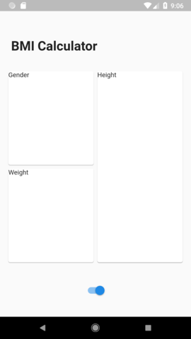
1. Input screen layout
The input screen is the view where the user will input their metrics. I see it as a Column with three elements: title, cards, and swipe button:
As you can see, we wrapped everything in MediaQuery.padding so that we are sure we the view will not overlap with platform UI elements (if you are smarter than me, you should use SafeArea widget instead). The title and bottom button will take “fixed” amount of space and then the input cards will take the rest in the middle.
Title widget is pretty simple:
And in the bottom part, we will use a Switch as a placeholder:
Notice using screenAwareSize method to take estimate the actual values of dimensions.
When it comes to building the middle part, it is just the combination of Rows, Columns and Expanded to make the cards split evenly:
At this point we have something like this:
. . .
2. Static gender card
Now let’s create a Gender Card widget that will be used to select gender by a user. Before we get into implementing UI, we need to create a Gender model:
2.1 Title widget
Let’s start with a title, we can see in the design that the title has the same style for every card, so it will be a good idea to extract it to separate widget:
Let’s add it the GenderCard widget:
And after that add that card into InputPage:
This is what we got for now:

2.2 Grey circle
We will display all of our contents in Stacks since it allows us to draw Widgets on top of each other.
As you can see, there are 2 stacks which at this moment could be avoided, they will stay here because we will need them in later stages. In addition to those stacks, we created simple GenderCircle widget which surprisingly will draw a circle 🙂 The circle will move down when we add gender icons.

2.3 Gender icons
There are three gender icons, each above the circle but with a different angle. To place them in the right spots we need to move them to the center of the circle, then rotate, then move outside the circle and then rotate again to straighten them up. We will also draw small lines between icons and the circle.
Let’s start with a line:
Now let’s take a look at gender icon widget:
Few things need explaining in this view:
- The default angle is the angle between the middle gender icon and side ones and it is equal to 45 degrees (or pi/4).
- We store angles for each gender outside the widget because we will reuse it when drawing an indicator arrow.
- Since we have access to svg assets, we are using Dan Field’s flutter_svgpackage to load them.
- The Other gender (middle one) is treated a bit differently. Since the middle icon consists of two icons, we make it a bit bigger so that it matches the rest. We also want to move the icon a bit to the right so that it nicely aligns with the grey line.
How we build the widget:
- Draw svg icon.
- Rotate it in the opposite direction to where it will be placed.
- Add a line below the icon (with paddings).
- Rotate icon with a line in the target direction (at this point icon is straight again but the line remained rotated in the desired direction).
- Lift “base” of the widget up half the size of the circle. This will make all icons look like they are centered around the middle of the circle.
It should like this:
2.4 The arrow
Now it’s time to add Arrow widget:
Those are operations performed to get the arrow:
- Draw an svg image.
- Since the image is rotated by default, we want to rotate it back so that arrow is pointing towards the middle.
- We move (translate) an arrow so that it is “pinned” to the center of the screen.
- We rotate arrow to the angle provided in the constructor.
Now let’s use that widget:
. . .
3. Interactivity
3.1 Handle tapping
Now we can finally allow the user to change the gender on tap. We could add GestureDetector on icons but they are relatively small, so it would be hard to click them. I figured out that the easiest solution is to split the gender card into 3 equal columns, each assigned to one gender. This way it will be easy for the user to change the gender. Let’s start with GestureDetector:
Again, there is nothing complicated here, we use Positioned.fill to make TapHandler fill the whole stack, and then we just handle the taps. We had to make one change regarding the width of the widgets. I removed SizedBoxfrom build method and replaced it with a Container in _drawMainStackmethod so that the stack would expand itself to full width.
3.2 Animation
The last part is to animate the arrow movement. We will do it by creating an AnimationController in GenderCard and passing it to the GenderArrowwidget. Let’s get to it:
Ok, so what we’ve done here:
- We added
SingleTickerProviderMixin - We created
AnimationControllerwhich can have values from max left angle to max right angle - We pass that controller to the
GenderArrow - We changed parent Widget of
GenderArrowtoAnimatedWidget. This way it will rebuild itself on every controller update. - We change tap handling not only to set state but also to animate the arrow with the fixed duration.
And that’s it!
This is how the final result for this part looks like:
🔥 BMI Calculator 🔥
Be sure to check out the other posts in the series!

Marcin Szałek
Founder of Fidev
Flutter enthusiast since Alpha release in 2017. Believes that sharing is caring, which lead him to start a technical blog dedicated fo Flutter in its early days. Loves to see beautiful designs become real apps and is willing to help make it happen. Enjoys sunny beaches far from home.
Join the newsletter!
Join the newsletter to keep track with latest posts and get my special Widget to animate views' entrances without any hassle for FREE!
Check out other posts!

Stripe Checkout in Flutter Web
Flutter Web is getting more mature every day. If you want to accept payments using Stripe Checkout in your Flutter web application, this article is just for you!

Stripe Checkout in mobile Flutter app
Have you ever struggled to integrate card payments into your mobile Flutter app? If so, today is your lucky day! In this post, I present how to use Stripe Checkout in the Flutter app without any hassle!

Interacting with Widgets using Framy
Have you ever developed a widget or a page and you wanted to make sure it works correctly in different scenarios but then it turned out that you can’t just reproduce all the cases you want to cover? Framy may solve such problems!
Great !
Thanks 🙂
muy buen blog estimado amigo, saludos desde Chile.
According to Google Translate, you say “very good blog dear friend, greetings from Chile”. If so, thank you 😀
Great, excellent!
Thanks for sharing it.
Dzięki za udostępnienie! 🙂
You’re welcome! I glad you liked it 🙂
Neat and clean design. I like that! 😀
🙂
Great
🙂
Praise!
🙏🙏🙏
Nice bro.
Thanks! 🙂
Hello Marcin,
I commented that point 2.3 is incomplete,
at the end you put an image of how it should be,
the problem is that he ate a good piece of code,
so that the icons could appear,
because with the code that you show does not appear,
this is the missing code,
you could add it for future readers,
Widget _drawMainStack() {
return Container(
width: double.infinity,
child: Stack(
alignment: Alignment.bottomCenter,
children: [
_drawCircleIndicator(),
GenderIconTranslated(gender: Gender.female),
GenderIconTranslated(gender: Gender.other),
GenderIconTranslated(gender: Gender.male),
],
),
);
}
You should also point out where are the svg to attach,
I will continue with your next tutorials,
very interesting by the way.
🙂
Hi Jhon, thanks for the comment 🙂
You are right, I just added the part showing how to use the icons.
Thanks 🙂
Absolutely brilliant. How did you get to know so much about all these widgets???
Hey, thanks 🙂 It all comes with time, now there is cool series on youtube: https://www.youtube.com/watch?v=Be9UH1kXFDw&list=PLOU2XLYxmsIL0pH0zWe_ZOHgGhZ7UasUE which is a great way to get to know some of the widgets 🙂
Thanks for sharing.
🙂